A pure CSS and bootstrap based gallery that displays images in an accordion interface with smooth sliding effects.
How to use it:
Load the Twitter’s Bootstrap framwork in your page.
<script src="//cdnjs.cloudflare.com/ajax/libs/twitter-bootstrap/2.3.2/js/bootstrap.min.js"></script>
<link rel="stylesheet" href="//cdnjs.cloudflare.com/ajax/libs/twitter-bootstrap/3.0.0/css/bootstrap.min.css" />
Create the html for the gallery.
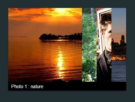
<div id="main">
<h1 class="text-center">a pure CSS gallery</h1>
<div id="gallery">
<ul id="wrapper" class="list-unstyled">
<li> <img src="https://lorempixel.com/250/250/nature" />
<p>Photo 1 : nature</p>
</li>
<li> <img src="https://lorempixel.com/250/250/animals" />
<p>Photo 2 : animals</p>
</li>
<li> <img src="https://lorempixel.com/250/250/fashion" />
<p>Photo 3 : fashion</p>
</li>
<li> <img src="https://lorempixel.com/250/250" />
<p>Photo 4 : suprise :)</p>
</li>
</ul>
</div>
</div>
The CSS (SCSS).
$bg-color : #222F33;
#main {
 background-color: $bg-color;
height: 100%;
width: 100%;
position: absolute;
 h1 {
 color:#FFF;
 font-weight:100;
 letter-spacing: 3px;
 padding:20px 0;
}
#gallery {
overflow: hidden;
height: 280px;
background-color: #000;
 width: 250px + 50*3;
margin: auto;
margin-top: 30px;
 @include box-shadow(0 2px 3px darken($bg-color, 8%));
}
#wrapper {
position: relative;
 width:250px*4;
height: 250px;
;
 li {
 float:left;
 width:50px;
 @include transition(all .5s);
 cursor: pointer;
 &:last-child {
 width:250px;
}
 p {
 position:absolute;
 top:255px;
 left:40px;
 font-size:16px;
 color:#FFF;
 font-weight:100;
 opacity:0;
 @include transition(all 1s);
}
 &:hover {
 width:250px;
 p {
 opacity:1;
 left:10px;
}
}
 &:first-child {
 width:250px;
 p {
 opacity:1;
 left:10px;
}
}
}
 &:hover {
 li:first-child {
 width:50px;
 p {
 opacity:0;
 left:40px;
}
 &:hover {
 width:250px;
 p {
 opacity:1;
 left:10px;
}
}
}
}
}
}


