In this post we’re going to take a look at a unique list of 25+ javascript/CSS based grid layouts I found around the world. All the grid systems listed below are responsive, fluid, flexible and easy to use so you can quickly and simply implement on your next web design project without having to write extra javascript or CSS codes. As the previous posts, this is a frequently updated list that it means I’ll update here the latest & best grid layout systems here to keep everything is fresh new.
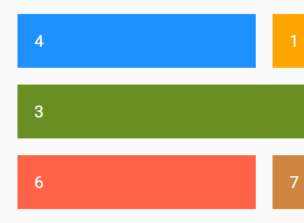
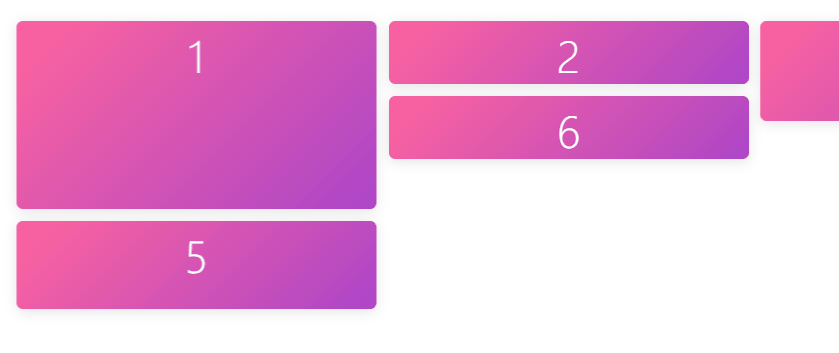
Click the title to download the grid layout. Click the preview image to see the live demo.
See also:
Sep 17, 2020 Update:
dirg.css
An extremely lightweight (~1kb) CSS library which helps you quickly render a responsive grid layout using CSS Grid Layout properties.
May 09, 2019 Update:
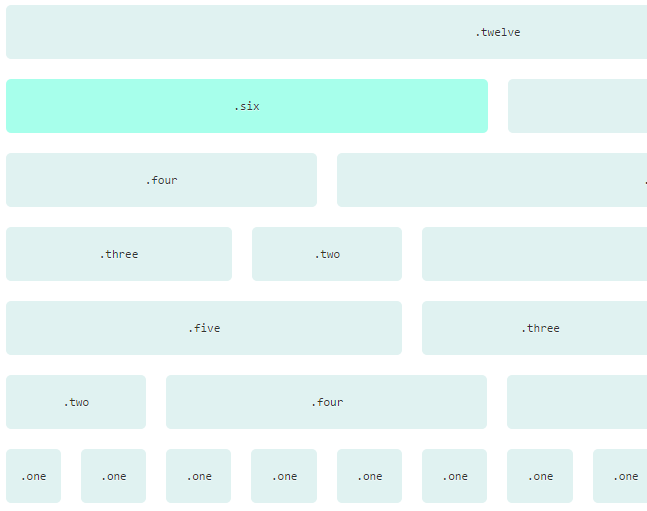
MiniMasonry.js
Minimalist dependancy free Masonry layout library.
Nov 19, 2018 Update:
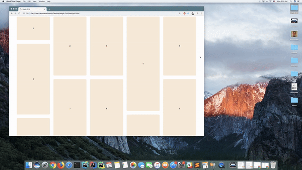
Magic-Grid
A simple, lightweight Javascript library for dynamic grid layouts.
Dec 08, 2017 Update:
iota
A responsive micro-framework for the grid spec powered by CSS custom properties.
May 27, 2017 Update:
griddd
A dead simple, customisable, flexbox-based griddd.
Apr 14, 2017 Update:
ragrid
Intrinsic first flexbox grid.
Mar 15, 2017 Update:
grassy
Build layout through ASCII art in Sass (and more).
Feb 20, 2017 Update:
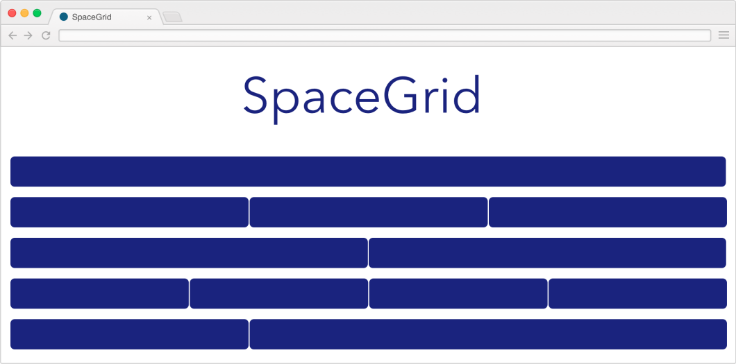
spacegrid
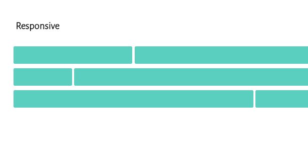
A basic, responsive grid layout to help you get started on your next project.
June 04, 2016 Update:
pills
A simple responsive CSS Grid for humans.
May 27, 2016 Update:
Lightweight and nestable grid system
The Lan Grid System is designed to be lightweight, nestable, responsive and simple to use.

May 14, 2016 Update:
Simple Grid
Simple Grid is a mobile-first 12-column CSS grid system to make developing responsive websites easy and fast.
17/03/2016 update:
grd
A CSS grid framework using Flexbox. Only 512 bytes (Gzipped).

21/02/2016 update:
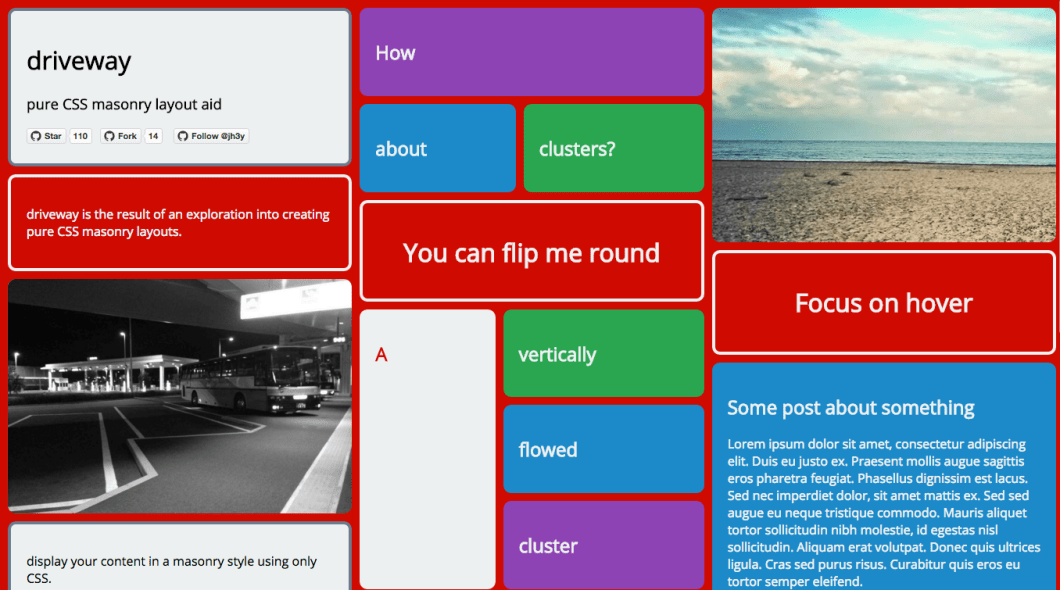
driveway
pure CSS masonry layout aid
19/02/2016 update:
bricks.js
A blazing fast masonry layout generator for fixed width elements.

17/02/2016 update:
Table Grid
Simple CSS grid system using `display: table;`.
15/12/2015 update:
gridly
The minimal (~100-170 bytes) grid system for modern browsers.
04/12/2015 update:
avalanche
Superclean, powerful, responsive, Sass-based, BEM-syntax CSS grid system

02/12/2015 update:
Gridilydidily
A highly configurable, data-attribute driven and sass based flexbox grid with inline-block fallback.
26/11/2015 update:
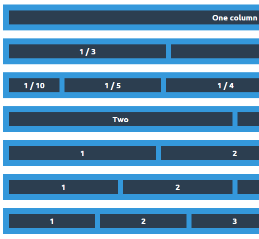
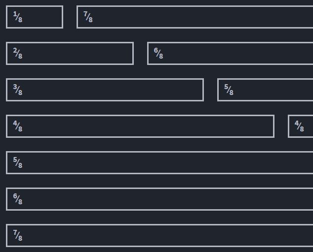
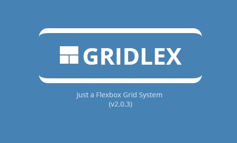
gridlex
Just a Flexbox Grid System
19/11/2015 update:
ayre
Sass powered responsive grid system.
10/11/2015 update:
gridifier
Async Responsive Html Grid.
26/10/2015 update:
gridle
Gridle is a set of complete and simple settings, mixins and classes that make the creation and usage of grid systems (even complex ones) really simple. All of this with full responsive capabilities
13/10/2015 update:
neutroncss

04/07/2015 Update:
Flex Grid Framework
A grid based in Flexbox and Stylus
02/07/2015 Update:
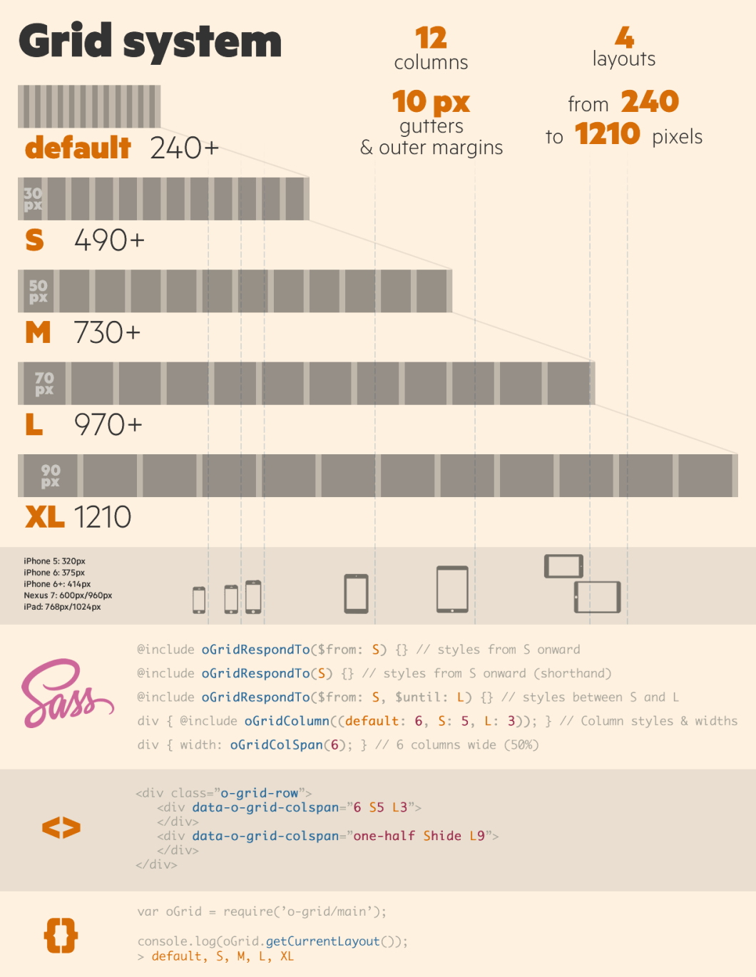
o-grid
A 12 column responsive grid system for laying out documents, templates and modules.
19/02/2014 Update:
Masonry
Cascading grid layout library. Masonry works by placing elements in optimal position based on available vertical space, sort of like a mason fitting stones in a wall. You’ve probably seen it in use all over the Internet.

gridster.js
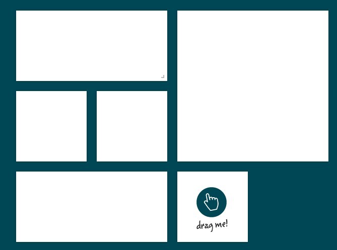
Gridster is a jQuery plugin that makes building intuitive draggable layouts from elements spanning multiple columns. You can even dynamically add and remove elements from the grid.
freewall
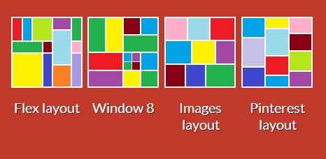
Freewall is a cross-browser and responsive jQuery plugin to help you create many types of grid layouts: flexible layouts, images layouts, nested grid layouts, metro style layouts, pinterest like layouts … with nice CSS3 animation effects and call back events. Freewall is all-in-one solution for creating dynamic grid layouts for desktop, mobile, and tablet…
mueller
MUELLER is a modular grid system for responsive/adaptive and non-responsive layouts, based on Compass. You have full control over column width, gutter width, baseline grid and media-queries.
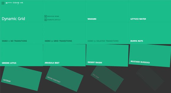
Dynamic Grid with Transitions
A dynamic grid layout that let’s you choose how many rows and columns of items are shown. Partly based on the visualization of Google Trends, except that you can add transitions.
JustifyGrid
Justify Grid is a new way to create layouts featuring text-align: justify and inline-block.
flexgrid
Next-generation CSS grid framework based on flexbox. Provides the same responsive 12 column fluid layout as Bootstrap 3 to most browsers. Even supports IE 6! Simple, fast, and easy.
Wookmark
This is a jQuery plugin for laying out a dynamic grid of elements.


Really Nice list… Thanks for sharing. I love Masonry so much 🙂
Great list, thank you! I have never used any of those but checked them out and I find all of them very good, each in its own way. I also think that Javascript grid control by ShieldUI should be included as well, it is very easy to use and has many features, combining many of the ones found in the systems you listed. It is shown in this demo, you may check it out on https://demos.shieldui.com/web…
Thank you, it is a really nice grid 🙂